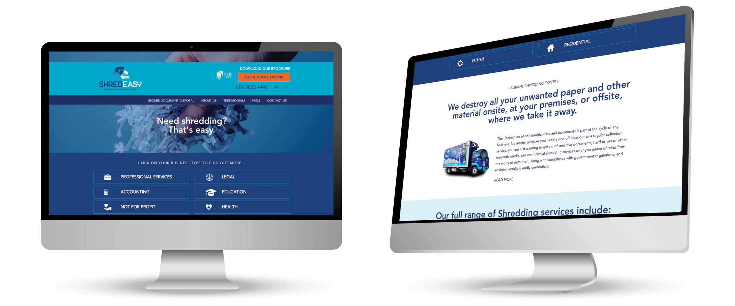
ShredEasy Website Design & Development
WhiteSpace has been working with ShredEasy for over 8 years now – after designing the original branding, site and collateral at that time. While the branding has stood the test of time, the website needed to be refreshed and modernised, with a new site structure implemented. The new hierarchy was focused on the core industries that ShredEasy works with – so the home page became an easy way for those particular industries to get in touch.
The site design retains strong use of the brand colours, with a increased amount of space between elements. Shredding is not a particularly warm topic – so we have incorporated imagery and language to make the brand and business personable and approachable. As CEO Neil Taylor said, “We have been using Whitespace Marketing for several years now and cannot fault the service and attention to detail. Plus they are really friendly too!”
BRANDING
PRINT ADVERTISING
WEB DESIGN & DEVELOPMENT
MESSAGING / POSITIONING
ONLINE ADVERTISING
PLANNING


